On Thursday I went back to the Tucker and French Family Forest to walk the dog so that she would be calm while Sarah worked. We explored a different trail so that I could scope out new painting spots.
The loop we took goes around Mill Pond which is covered in lily pads to the point that it looks like an open field. I decided to come back with my paints to do a close-up of some of the lilies.
I set up on the bridge at a slight angle from the lily pads. The canvas board I used is only 5 x 7″ which can make getting details difficult. In the last painting I did of lily pads I had to suggest the general masses of plants. By getting close this time I could make the lily pads more discernible.
Working fairly quick, I blocked in the flowers and pads, paying close attention to the water shapes. I tried to limit my use of white so that the greens were more saturated and lively.
Mill Pond Lilies 5 x 7″
After about 2 hours I was finished. As always, the light had changed and I didn’t want to play around with everything I had already established on the canvas and ruin it. The flowers gave me some trouble because I could not put as much nuance into them as I wanted to. I kept laying in more and more paint, trying to capture the luminosity of the petals, and this made it difficult to get the detail I wanted. But I do like how their brightness provides some nice contrast to the lily pads.
That evening Sarah and I decided to go up to Kennebunk and stay at her parents’ place for the weekend. It gave me the opportunity to explore the Rachel Carson Wildlife Refuge. Once again, we took the dog for a walk first and then I returned with my paints.
Though I am not a huge fan of setting up on bridges and boardwalks, I once again had little choice. The best view was from a boardwalk over the saltwater marshes. The ground below was firm enough to support my tripod so that it did not need to be in the way. Whenever someone would pass by, I was able to give them enough space.
The tide was high when I arrived and then it dropped about a foot or so by the time I finished. It was also an overcast day and a little windy. Despite all this, the lighting was fairly consistent and the painting moved fast.
Overcast Tidal River 5 x 7″
I am extremely happy with the end result. I think there’s a pretty good sense of depth and a strong variety of color. With all these small paintings I’ve been making, I need to start buying some more frames.
It’s in the 90s today. That’s usually not weather conducive to painting. However, I made my way a couple minutes down the street to the Tucker and French Forest and set up my pochade box.
I walked for a bit and came to a bridge on Patten Island. I usually avoid painting on bridges because of the restricted space, but I figured too many people wouldn’t be out and about. Besides one runner and a father with his son, I was right.
I’ve painted at the other end of the Tucker and French Forest before. Last summer I did a lily pad painting that I never quite finished. There are plenty of ponds throughout the preserve, so there is never a shortage of great subjects. This past weekend though, Sarah and I took the dog to a different entrance and found that the trails on that side are more maintained. There are several bridges and boardwalks. After that discovery I couldn’t not paint this week.
Since I was painting on a bridge, I put the tripod over the side and extended it to its full height. That way there would be nothing actually on the bridge and I could move out of the way if someone came by.
The light moved very quick. I started painting around 10 am and finished at 11:30 am. You can compare the before and after photos to see the difference. I tried to preserve the saturation and brilliance of the original lighting in the painting.
The water was very brown and dark. There are beavers throughout the forest and I was on the lower end of a dam. I assume the water is full of sediment. That’s probably where the color comes from. I’ve been trying to purposefully paint water more often and this was good practice for non-blue water.
Patch of Lily Pads 5 x 7″
My greatest struggle was the patch of shadow behind the taller plants in the background. Initially that area was very dark and I felt I could unify it. But as the light moved eventually more of the shore was lit up. I didn’t want to paint those details and have it be too confusing.
I’m going to try to get out again tomorrow morning for another small painting. If I can’t, well it looks like we might head up to Maine this weekend. Perhaps I can get another painting at the Wells Reserve done.
Last summer Sarah bought me a sketchbook from The Sketchbook Project for my birthday. It’s a cool project where artists fill in sketchbooks and send them off to the Brooklyn Art Library. Visitors can then check them out and read them.
If you finish your sketchbook in the allotted time, then they will be taken on a tour and brought to several cities in the US. Though I did not finish my sketchbook on time, it will still be kept in the main library and uploaded to the website. Once that is done, I will share the individual pages here.
Until then enjoy my quick walk through of the sketchbook!
Saturday is my birthday and my parents were wonderful and got me a pochade box. My French easel can get quite heavy and awkward and so I’ve been looking at lightweight alternatives the last couple of years. Needless to say, I was very excited when I got the gift.
Pochade apparently comes from the French word for pocket (poche). The version I got is made for 5×7″ panels, so it definitely lives up to its namesake! The kit came with the box, a tripod, a gessoed panel, some brushes, a brush cleaner container, a medium container, and a viewfinder. It was delivered yesterday and this morning I realized I couldn’t really wait more than 24 hours to try it out. So despite a terrible forecast and heavy cloud cover, I drove on down to Massabesic Lake and did a quick painting.
I was originally going to the Audubon Center on the lake but I accidentally found a park to pull off at. It had a view of a small marina. I liked how misty the trees and hills in the distance were. It seemed good enough for a tiny painting!
I walked to the far end of the park and got set up fairly quickly. The one thing that is really nice is that I was able to preload the palette with paint before leaving. I can’t do that with the French easel. And it’s all so light to carry! The pochade box fits in my backpack and the tripod has its own carrying case. Not hard to manage at all, though I am thinking of sewing some straps to my bag so I can attach the tripod and umbrella and then walk hands free.
Considering it had been cloudy all morning, I was not expecting the sun to actually come out. But it made an appearance for a half hour. And then came the rain. While I was under a tree, I still got wet. So up went the umbrella to keep the rain off the painting.
It attached easily enough to the leg of the tripod. I was pretty happy about that. And of course water and oil don’t mix, so I was able to keep working despite the weather. After about 2 hours I called it a day and headed back home.
Massabesic Lake 5 x 7″
The light was constantly changing and still I think I captured how gray and misty it was. Maybe the foreground reeds are a little too dark. I tried to give them enough shadow to create more depth in the painting.
In a couple weeks we’re going camping and I’m excited to bring the pochade box along. Maybe it’ll even be light enough to hike with?
It seems like this is becoming more and more of a summer blog. I know I express my regrets each year about that, but it’s definitely difficult to find the time to work on art during the school year. Between teaching and taking classes myself, my time is limited. That said, I did draw a decent amount in the sketchbook that Sarah got me for my birthday last summer. It’s pretty much full now. I need to finish up one sketch and then I’ll make a video of it. I also started an oil painting featuring my friend and his dog. So stay tuned for all that.
It’s been interesting to see how the artists I follow have reacted to the pandemic. A lot of them have flourished. And then plein air painters like Michael Chamberlain have had to pivot a little bit and do process videos in the studio. I’m happy that the start of my summer has coincided with the opening up of New England because it gives me the opportunity to get out and paint outside. Unfortunately, it seems like with the increasing number of cases that many states will return to isolation. Hopefully, we can stay level headed up here in New England and maintain caution. I’d rather enjoy summer in a limited capacity than not at all.
On the 12th Sarah took a half-day and we went slightly north to join her family at the Wells Reserve at Laudholm. Her family has been living up in that area for several years now and I’m surprised we have not been to Laudholm until now. It’s a beautiful and historic farm that has been converted into a museum with hiking trails and beach access. We’ve been up there a few times since the 12th and have enjoyed it so much that we purchased a membership. I may wind up doing most of my plein air paintings there.
The first painting I did was a small 4×4″ study of the waves off Laudholm Beach. I probably spent 2-2.5 hours on it, which was longer than I intended. Water is tricky. Sure I’ve painted the ocean before, but I’ve never really concentrated on waves.
Laudholm Beach I 4×4″
This study made a few things clearer for me. The whitecaps are the lightest part of waves. The spaces between waves are usually a midtone and the darkest part is just beneath the whitecaps. It took me the entire painting to really figure that out. Whereas a building or tree is stationary, the waves move and are never the same, so I spent a lot more time just staring at the ocean and trying to figure out the general construction of waves. I also realized that there’s a bit of translucency at the tops of waves where the light comes through and turns the water aqua or green. I think I’ll grab some more 4×4″ panels and do wave studies throughout the summer. I also need to work on the transition between the ocean and sand.
A couple days later we were back in the area and went to Mother’s Beach in Kennebunk. The tide was high and I climbed over a few rocks to find a tide pool to paint. This was another study and the panel was only 5×5″.
Mother’s Tidepool 5×5″
We were there just around noon, setting the sun right above me. I had very little shadow to work with. This is usually why I paint early in the morning or in the afternoon. Heavier shadows are easier to paint and give a subject more depth. With the sun coming straight down, I struggled to clarify all the planes of the rocks. They became more unified under the brush.
My biggest takeaway from this study was the way water changes the color and tone of a partially-submerged object. The lightest tones of the rocks were above the water. The darkest tones were where the water met the rocks. Then as the rocks continued underwater the tone lightened to mid-tones.
We returned to Laudholm on the 26th and I did a larger painting. We arrived right before high tide and in about 2 hours the tide chased us away. I suppose the changing environment is the beauty and challenge of painting outdoors. It was annoying to leave though, because the 2 hour mark is when a painting usually begins to take shape. It’s at that point that I’m able to refine details and play with color relationships more.
Laudholm Beach II 9×12″
I’m mostly pleased with the results. As per usual. When you make something you always know where the faults are. I would’ve liked to fiddle with the rocky shoreline more. It was darker than the ocean but I think I pushed that too much. Laudholm is also very windy so I paint there without an umbrella, and the direct sun causes the painting to look much lighter than it actually is.
We plan on going up to Kennebunk for the 4th so I’m hoping to get a couple more paintings done soon. It would certainly be nice to update this blog every Monday. Also! I’ve been fiddling with this website to include a gallery where you can view finished paintings. More updates should be coming soon as I reorganize things. I’ve had this blog for 7 years or so and it’s time to change things up a bit.
August is here! And my birthday has gone by and I’m officially 28! Very crazy that I’m just a couple years away from 30. I can’t believe it!
I’ve been doing a decent amount of painting recently. In particular I have been working on a landscape plein air painting of a pond down the road from my house. I’m three sessions and about 7 hours in. I think two more sessions should finish it up.
I also completed a tiny 5×5″ still-life painting of one of Sarah’s succulents.
I was initially inspired by the blooming stalk. It appeared early in the summer and so I brought the plant inside and set it up on a box and did a quick sketch. Loose and gestural, it was a good start to the painting.
Before my second session, I scraped down the entire panel to smooth the surface and remove thick blobs of paint. This gave the painting a weathered look that I enjoy. At the conclusion of this painting I realized I was going to have to do some editing. The flowering stalk was growing too long and I could not fit it in the composition.
Succulent 5×5″
In the final session I shortened the stalk and reddened the flower buds in order to provide a complementary contrast to the green body of the succulent. Working so small gave me the opportunity to really rework the surface in ways that I often neglect to in larger paintings.
Last Friday I began the painting of the pond and then feeling the plein air bug, I went out on Saturday to do a coastal painting.
I wound up at Hilton Park in Dover, NH. I’d never been before but it provides a great view of the Little Bay Bridge into Newington. It was also decently busy for a park that doesn’t allow you to swim. There’s an incredibly fast current that races beneath the bridge. I watched several fishing boats motor beyond the bridge, cast their lines, and then be swept down current in ten minutes and have to do it all again.
With so much blue to work with, I began by toning my entire canvas in ultramarine. The bridge was my eventual focus, but I spent the first half of the session fiddling with every other part of the painting. With that out of the way, then I could focus my attention on the play of lights and darks along the bridge’s beams.
I’m glad I started the bridge by putting in the darks and greys. This established the back side of the bridge and allowed me to easily drop the lights in.
Little Bay Bridge 10×20″
Before I called it quits, I went around the entire painting and tried to harmonize everything. I also reworked the water, trying to replace white tinted colors with saturated colors.
Finally, I did a sketchbook tour of my latest Moleskin. Check it out!
In the video I talk about all the paintings and artwork I’ve drawn inspiration from during my museum visits. I thought it would be interesting to post the originals below and provide a little commentary on each one.
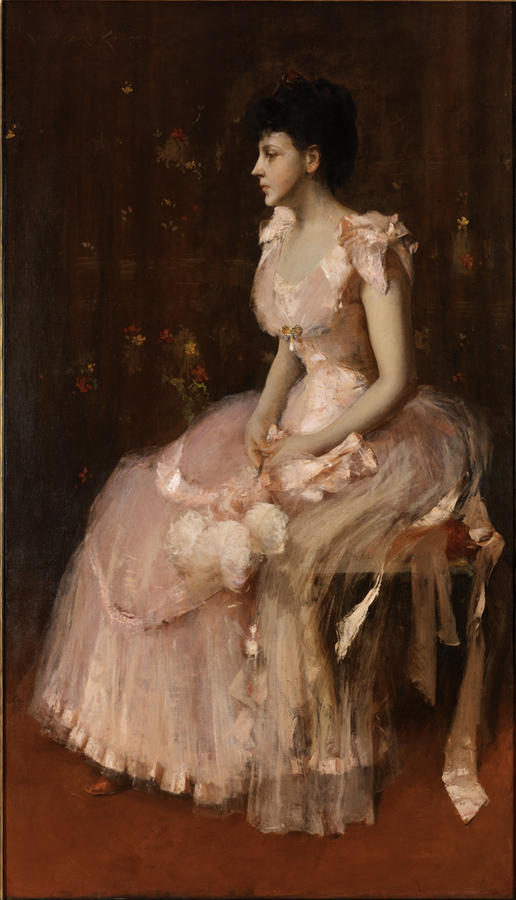
Portrait of a Lady in Pink William Merritt Chase
I have wanted to do a large seated portrait for a while. So I am often drawn to those paintings. This one had me contemplating how to deal with so much pink.
Arrangement in Flesh Color and Brown James McNeill Whistler
Whistler’s Symphony in White is one of my favorite paintings of all time and when I saw this painting, I instantly drew the connections. Simple and strong.
Augustus Saint-Gaudens II Anders Zorn
I know Zorn is one of the greats, I just haven’t seen too much of his work. However, this etching caught my attention with its ability to convey shadow and light.
Lake O’Hara John Singer Sargent
It’s Sargent. I think I stared at the logs in the foreground for ten minutes. It’s such a perfect scene. I want to paint sunken logs now.
Bust of an African Woman Charles Henri Joseph Cordier
The hair, neck, and cloth combo on this bust is amazing. Very regal.
Portrait of Fräulein Maria Wüsthoff Wilhelm Trübner
I really do like mono-colored portraits. I was most intrigued by the translucency of the dress around the neck and collarbone.
Self-Portrait in Tuxedo Max Beckmann
Though he looks like a blockhead, I love the way Beckmann organized his facial structure. And the five o’ clock shadow comes off nicely through his use of greys and greens.
Negro Soldier Robert Smullyan Sloan
I was really stuck on this egg tempera painting. It’s so delicate and precise. It reminded me of a Northern Renaissance portrait.
The Yellow Dancers Gino Severini
Though I tend to like paintings that are more realistic, I do love the way how the impression of the dancers is conveyed through simple shapes.
The Hangover (Suzanne Valadon) Henri de Toulouse-Lautrec
The woman in this painting has such an attitude that fits well with the title of the piece. Great facial expression.
Racehorses at Longchamp Edgar Degas
I marveled at the horse legs in this painting. And then because it’s such a dark painting, I really appreciated the pops of color in the jockey jackets.
Women of Paris: The Circus Lover James Jacques Joseph Tissot
The sheer amount of work that must’ve gone into this painting is incredible. There’s a great balance between looseness and exactness that is not conveyed well through this photograph.
Well, that’s all I have for today. Until next time, when I hope I have my pond painting finished.
Summer is in full swing and that means a few things: 1. No kids. No teaching. So no need to shave, right? 2. Beach time. 3. Writing time. 4. Painting time. 5. Blogging time.
I’ve been dedicating most of my time this summer towards writing. In the fall I’m attending University of New Orleans’ online MFA Creative Writing program. Since I’ll be teaching at the same time, I want to make sure I have enough material prepared. I’ve been able to squeeze in art time as well, but it’s been mostly dedicated to filling out my sketchbook. It’s almost done, so a video tour will be coming out soon.
Last time I posted it was winter. And I still have two winter paintings to share before we get to the summer works.
After hiking Mount Lafayette, I hike Mount Cabot with my friend Mike. Cabot is the most northern 4,000 footer in NH. Here’s a picture of me at the top:
I’m sporting the hat I bought in Peru last summer. It’s perfect for winter hiking because it lets out just enough heat to prevent me from getting too sweaty.
The trees were absolutely covered in snow and frost when we were there and it was inspirational. I wanted to try my hand at painting the range of whites and regretted not even having a sketchbook. I took some photos and decided I would work on something at home.
The view above was what I settled on. I told myself to not get lost in the complexity and then did a sketch to work out the values and focus.
Cabot in White 9×12″
I only worked for a couple hours on the sketch and then put it aside with the intention of returning to it. I never did. Looking at it now, I’m actually very pleased with the result. I think it reads well, though it does look a little too illustrative, like it’s a still from How the Grinch Stole Christmas.
The reason I never returned to the sketch was because I moved on to doing a painting of my friend Dave at the top of Lafayette.
The block in was fun and I tried to maintain the looseness throughout the entire piece. My biggest struggle was separating the foreground from the background.
I spent too much time working on the jacket. It was fun to mix the oranges. In this second stage I adjusted his head and tried to make the foreground more cohesive.
King of Lafayette 9×12″
I’m happy with the final. I’m not the happiest with the photo, but I’m really limited with studio space at our current place. It is what it is. Let’s get to the summer.
Sarah and I spent the summer up at her parents’ place in Kennebunk. On the Fourth of July we went down to Mother’s Beach and spent a few hours in the sun. I forgot my umbrella so I slathered up in sunscreen and perched myself on the rocks to get a good view.
Because of the direct sun, I wasn’t able to judge the color perfectly. That’s why I have an umbrella usually. Yes, it helps keep the sun off me too, but mostly it helps me judge what the painting would look like indoors. That said, my colors came out a little too earthy, meaty, and dark.
By the end of the session, the tide had retreated quite a bit. This was a drastic change from the start when I had the water lapping at my toes.
Fortunately, we stayed up in Maine for a few days. The next day we went back to the beach and I set up shop once again.
Mother’s Beach on the Fourth 9×12″
My goal for the second session was to add a little more vibrancy through saturation. I tried to avoid including too much white in my mixtures. Still, I was working without an umbrella. I fiddled with waves for most of the time, not sure how to properly convey them. Several times I just stood and watched the waves and made mental notes. I still don’t think I got them right. Water continues to give my the most trouble in plein air paintings.
I did have fun with the figures. I kept them to simple and quick brushstrokes. Sarah makes an appearance twice. She’s floating with her cousin in the tubes on the left and then she’s seated next to the wall on the right.
I also managed to get in some sketches over the weekend. I’ll save those for the video, but for a sneak peek, here’s a look at the sketch I did last week at the RISD Museum in Providence, RI.
That pencil sketch took me about fifteen minutes. I was with my parents, so I did not want to hog all the time doing drawings. After the museum, we walked around Brown and Providence and I bought a bunch of 4×4″ and 5×5″ panels at the RISD store. This morning I got a chance to try them out.
After a little exploring on Google Maps, I decided I would go visit the Wentworth-Coolidge Mansion in Portsmouth. It is the historic home of colonial governor Benning Wentworth and was built by combining several buildings together. This is why it has such a varied and unique appearance. I love the angles. And though I went expecting to paint the water and islands around it, I quickly decided it was the more interesting subject matter.
I walked around for a few minutes, concerned I was going to be thrown off the property. The signs said the grounds were open, but I was the only visitor at 10 am.
I realized I would have to stand in direct sunlight in order to get a good perspective. The sun would be at my neck, but it would be worth it. I went back to my car, gathered my supplies, and returned.
It was nice to have an umbrella again! I took time to sketch out the entire building on the tiny 5×5″ panel and then quickly blocked in the colors.
Above you can see how small the panel was on my easel.
When I’m painting, I often only use one brush at a time. It’s not the most effective method. Many painters keep a brush for each of the colors they’re working with. I gave that a go and dedicated specific green, blue, red, and yellow brushes. I feel that this simplified my process and kept the painting fairly unified.
I wrapped the painting up in about ninety minutes, spending the majority of the time working on color variety and value.
Wentworth-Coolidge Mansion 5×5″
It’s not perfect, but it’s my favorite plein air painting in a while. I’m definitely going to do more in this size in the next week or so. They’re quick and allow me to concentrate my efforts on my weaknesses.
Before I left I snagged a photo of the water and islands that the mansion looks out over. Tomorrow I go on a Boston museum trip with my mother!
Towards the end of break I hiked Mount Lafayette with a few friends. It took us a good portion of the day, but it was a decent temperature and sunny. Along the way I took a bunch of photos to practice my winter painting. It still hasn’t snowed too much here in southern New Hampshire and winter painting isn’t quite the same when all you’re doing is freezing and not painting snow.
Over the summer I tried to do a plein air painting in Kennebunkport, Maine, but time did not allow me to complete it. So I used it as an underpainting. You can still see the bumps and lines from the previous painting, which isn’t the greatest, but it’s a practice piece.
I spent two sessions on the piece for a total of about 3-4 hours. My goal was to test out atmospheric perspective with the mountains, but I think it reads a little better in person. The closer mountains got turned too green by the camera and lost their blues.
Hoping it snows soon so I can get out and paint a winter landscape for real.
Merry Christmas! Hope everyone is enjoying the holidays. I usually start off these blog posts by mentioning how busy I’ve been and this one will be no exception. I have been working on applications for an MFA in Creative Writing. All my free time efforts have been going to that and so my art and this blog have unfortunately fallen by the wayside.
This year I promised I would have no grading to do over the holiday break. Somehow I managed to keep that promise. Which means I have been able to dedicate time to things I enjoy. Like reading. I’ve got so much reading to do. The last few years I’ve been steadily increasing the number of books I read, but I’m not going to reach my goal this year. Don Delillo’s Underworld absorbed too much of my time.
And since I’ve had some free time, I went outside for my first true winter plein air experience.
Though we got hit with some back to back snowstorms a month or so ago, we’ve had little snow since, so the we wound up with quite a brown Christmas. Last year we got the opposite. We had a mini blizzard on Christmas day.
Snow is the main draw of winter plein air and without it I had to turn to the second best thing. Ice. It’s been cold enough for that at least.
I drove a couple towns over to Durham and did some reminiscing as I went through the UNH campus. They’ve added some large buildings since I graduated, but it still feels like home. I parked at Durham Landing and walked along the Oyster River until I found a spot that intrigued me. I was very excited. The view offered rocks, ice, and flowing water. I’m thinking of doing quite a few studies of that spot as the winter progresses. When the snow comes, I’m sure it will be beautiful. Maybe one of my New Year’s resolutions should be to turn those studies into a larger painting. Man I should’ve jumped on the Michael’s Black Friday deal and bought the 5 foot canvas for $33.
I wanted to try a new palette because my last few plein air paintings have felt too consistent. Maybe that’s not the right word. Basically, I want to try to vary my color.
I dug through a box of my unused paints (ones that my mom gave me or came free with orders from Dick Blick) and found some interesting options. I settled on: Sap Green, Transparent Oxide-Red Lake, Prussian Blue, Raw Sienna, Old Holland Yellow Light, Permalba White, Torrit Grey, and Ivory Black. Using the Yellow Light as my white, my hope was that everything would be a little dulled down since it is an off-white color. Then at the end I could come in with the Permalba White and make the lights pop. I especially wanted to try this strategy on the snow.
But I waited too long and the Permalba White froze and wouldn’t come out of its tube. Which is fine, but definitely disappointing. I learned a few things from this session that I will carry forward to the next. Like: bring a lighter so that you can warm up the ends of the paints and get the caps off easily. Had to use my teeth. Which is something my dentist dad probably doesn’t want to hear. Also, getting carcinogens anywhere near my permeable membranes is not usually on my to do list.
The block in stage was quite enjoyable. Time has flown by and I definitely missed painting. I even talked to myself as I worked, getting hyped for my decisions. That’s not weird. Promise. But as the day went, I got colder and colder. It was about 20 degrees Fahrenheit in the sun and I was in the shade. My feet and toes got the worst of it. The rest of my body was fine. Even with both gloves and mittens on, my fingers turned red. The problem is that the palette hand simply stays in one position the entire time and the painting hand needs to be mostly free for mobility.
Some hand and toe warmers will fix those issues I think. And if not, well we’ll see how much I paint outdoors this winter and if it warrants getting some nice winter boots. I’m planning on doing a lot of hiking this winter as well, so perhaps boots would be a good investment.
Though I didn’t include the bridge in this study, I’m planning on adding it in the next. With the bridge in view, I believe the shadows and light will make more sense.
I’m thinking each study will examine different perspectives of this view and also try different palettes. Then I can use them to rough in a large canvas before bringing it on location.
I’ve been searching for videos that go over plein air painting rivers, but have found few resources. If anyone has some suggestions, please send them my way!
I was listening to Steve Atkinson talk about plein air painting yesterday and he said that honest painters will admit they fail all the time. It’s part of the learning process. I’m not saying this study was a complete failure, but it sure did challenge me on many levels. Looking at the painting now, I can see that I lost the organization of my values. Everything seems to be all mushed together and there’s little separation between the different planes of the picture. Definitely something to keep in mind next time. That said, I believe this study reads the best from afar. So go ahead and take a few steps back from the screen. Does it come together? Is it easier to understand the relationships of the shapes? If not, I think the on-site photo does a good job of distancing the painting.
I’m considering it a decent success and I’m excited to go back and do another.
Yesterday I was out at Rye Beach getting ready to paint and I came to the realization that I’ve spent almost every morning this summer outside. I painted a decent amount last summer, but I feel that being closer to the seacoast has encouraged me to plein air paint more. I also focused more on writing last summer, so I spent most mornings at my computer.
My summer break is now halfway through and I feel like I’ve accomplished a good amount, so I’m hoping to keep the pace for the rest of the summer.
Last Tuesday I went with the NHAA plein air painting group to Rye Harbor State Park. When I left our apartment it was sunny and warm, but the ground was wet from some overnight storms. As I got closer to the coast a heavy fog set in and it was hard to see more than 100 yards away.
I was excited to set up and paint the boats in the marina next to the park, but I didn’t want to fight the fog, so I chose a different view.
You can see how foggy it was in this first photo. The tide was out and forming large pools in the rocks and I was attracted to the variety of grays.
Around the time I wrapped up, the sun was sneaking through the clouds and changing the lighting. I spent only 2 hours on the painting and called it quits. Though after I’d packed and went around to look at the other artists’ work, the fog settled back down and the sun disappeared. I suppose I could’ve kept working.
This was a leftover 8×10″ panel, so a little smaller than the 9×12″s I’ve been working with lately. I’m gonna have to look up more paintings of shorelines, waves, and rocks. I need to see how other artists have tackled those subjects.
In between plein air paintings, I’ve been drawing in my sketchbooks. I’m slowly getting better at using watercolors.
One afternoon I sat down and drew my cup of tea. This was a break through illustration. I finally figured out how to tackle the combination of ink and watercolors.
A couple days after my birthday I traveled down to Boston for the day for a free entry promotion at the Isabella Stewart Gardner museum. On my way in I stopped in Harvard and sketched Memorial Hall.
I think limiting the size of my sketches has helped me develop an understanding of watercolors. I can fill in the entire drawing quickly and practice mixing colors and see how they interact on the page.
At the Isabella Stewart Gardner I sketched the courtyard. Since it was free entry, it was incredibly busy, but I was able to find a bench to hangout on as I drew. You can see this sketch and all the others from my first two sketchbooks in my first sketchbook tour video.
I’m now on my third sketchbook and I’ve already finished a few drawings in it.
Above I sat with Sarah in Portsmouth and did a sketch of her. It came out nicely and I’m excited to fill this next sketchbook up and show it off.
This Tuesday I went out again with the plein air group. The meeting point was Odiorne Point boat launch, but I’ve already painted there this summer so I decided to go down the road a bit to a spot I’d seen the day before.
Near Rye Beach is a tidal inlet that snakes past some houses and tall patches of grass. The composition is ready made.
I wanted to include the water, the houses, and the boat, so I had to really pull my perspective out and draw things smaller than I was seeing them. Painting on a 9×12″ board forces decision making.
It wound up being a two day painting. I reworked the water twice on the first day and then twice again the next. I’m still not entirely satisfied with it. If I had backed the perspective up even more I would’ve been able to include some darker parts of the river and I think that would’ve helped make the water convincing. As I’ve painted water this summer, I’ve discovered that the reflections are often much darker than I originally expected. I’ll have to keep that in mind for the next ocean painting.
My paintings this summer have felt very cohesive in their colors, but I’m afraid they’re becoming a bit stagnant and my paintings are appearing more illustrative than realistic. They’re much more saturated than paintings I’ve done in the past. For my next couple of paintings I’m gonna mix up the colors I use. I’m really still painting with the palette that was prescribed to all students in my UNH art classes. I think it’s time to branch out.
While I was working on this painting, several of the people that live in the houses came out and talked to me. One nice couple later invited me inside to show me other paintings they had of the same perspective. One was a winter scene and the other a summer scene and it was interesting to see how the shoreline has changed throughout the years. Apparently there used to be an old barge that was parked against the left hand shore. It’s now gone and nothing remains to indicate it had ever been there.