2

The Energy in a Sugar Jar

Summer is here. It doesn’t feel real. A couple weeks ago I graduated with my M.Ed. and now my internship will be done in a week. It’s hard to believe I’ll be teaching in a few months and being paid to do it. Really the reason it feels weird is because I’ve been so busy with work. I was able to get a little reading done in my free time, but my art progress slowed. Occasionally I got to paint. And because I wasn’t able to devote large blocks of time to making art, it to took me several months to finish one painting.

OLYMPUS DIGITAL CAMERA

Sugar Jar

9″ x 12″

I started this painting right after I finished my Blue Winter Self-Portrait. I was inspired by the color variety I was able to explore in the shadows. Hopefully the pinecones are still readable as pinecones. Here are the progress photos:

sugarjar - 1

sugarjar - 2

sugarjar - 3

sugarjar - 4

sugarjar - 5

And the final photo once again:

OLYMPUS DIGITAL CAMERA

I’ve been finding and following a bunch of artists lately. Many of them have mentioned the difficulty of taking the energy present at the beginning of the painting and maintaining it until the end. I loved the looseness and playfulness of the self-portrait and wanted to replicate it. I did bring an energy into this still-life but I’m not sure I carried it through. I think I got caught up too much in the exactness of the sugar jar. Edges are my new focus. I have a feeling the movement and energy of a painting can die there.

0

Patterns

Several weeks ago I started at Exeter High School as an English intern and since then I’ve been swept up in the start of the school year. At the beginning I was spending most of my days mentally planning out what to say to the students. Since I teach the last class of the day there is plenty of time to build up some anxiety. But I’m relaxing now and don’t get too nervous until ten minutes before the class begins.

Though I’m teaching English, I’m still spending my afternoons painting. I set up a still life in the spare bedroom right before the school year began and I’ve been whittling away at it.

vase - 1

In the past I used canvases straight from the factory. I’d tone them and then paint. The woven threads, or tooth, of the canvas often showed through my paintings. I didn’t like it. The tooth was too perfect, too symmetrical, and pulled attention away from the actual painting. To remedy this problem I gessoed my canvas several times, sanding between coats with 80 grit sandpaper. I didn’t create a perfectly smooth canvas, and nor did I want to. I left the brush strokes barely visible in the gesso so they would later show through a bit. This would make it appear as though I was applying my oils over other layers of paint. The imperfections would help create a more painterly finished product. After gessoing the canvas I toned it in a mid-tone of blue-gray.

vase - 2

The idea for this still life stemmed from my acquisition of a black, metal teapot from my parents. They’re cleaning out their house and found it hidden in a cabinet. The hammer and vase were added as I developed a theme, which wound up being: black. It’s hard to paint the variations in the darks and I wanted that challenge.

vase - 3

Since the canvas had been toned blue, I decided that I would use something orangey-red as contrast, allowing the blue to peek through in places and give the viewer’s eye some nice visual stimulation. I found my girlfriend’s old tapestry in a bag and used that for contrast. I stacked up a few boxes and draped the red cloth over them

vase - 4

Much of my inspiration for this piece stems from the work of David Cheifetz. Particularly The Experiment. I also borrowed his technique of putting a two-way fold in the cloth to give the painting more depth. You can see an example of this technique in Prosperity. I used it in my painting to give the teapot more height so it would balance out with the vase.

vase - 5

The most fun I had was putting in the rough patterns on both the vase and cloth. I did not try to get too exact or particular. It was a bit like sketching. I was trying to just figure out where everything needed to go.

vase - 6

After one full paint through for each object the painting started to come together. I fell in love with the vase and spent many early sessions devoting attention to its gold patterns.

vase - 7

Once I had everything mostly laid out I began tackling the background. Here I went with a flat brown and then realized it was too dark. Something need to be remedied. It needed more light.

vase - 8

The setup was lit left to right so I decided I should echo that flow of light in the background. I spent an entire four hour session working it out. I pre-mixed dozens of colors in order to give the background a speckled, multi-colored effect.

vase - 9

Next I had to lighten up the cloth. I explored different mixtures, seeing how cadmium red would develop when mixed with burnt sienna, cadmium yellow, and cadmium orange. I brightened the top right tremendously and slightly brightened the bottom right.


IMG_0085

Patterns 12″ x 16″

After adding the lights and highlights, I had to work on the darks. The left sides of the teapot and vase needed darkening to make them appear more round. My last session was mostly spent tinkering here and there to see what more I could do.

The final photo left the cloth appearing a little more orange than it is in life, but it’s a good representation besides that. I’m excited to start the next setup. I already have a plan.

If you’re interested in Patterns, it is on sale for $650. To purchase, send me a request at thewritingmann@gmail.com!

4

Beside the Thirsty Moose of Dover

Last week I began an ambitious painting on a 12″ x 16″ canvas. I wanted to commit myself to a multi-day piece. My time spent in Portsmouth and Kittery made me want to paint major scenes from several seacoast towns. Since Dover is right down the road, I went there first. Dunno why I didn’t just stay here in Newmarket.

Due to morning errands, I had to start in the afternoon. I puttered into Dover around one and walked around for half an hour looking for a spot. Originally I had wanted to paint the mills and the Cocheco River, but I couldn’t settle on a view I enjoyed. Lugging my easel a couple blocks north I found something that would work. Standing beneath the awning of the Thirsty Moose I had a direct view of town hall.

IMG_3233

It was overcast the first day and very cloudy. The painting was a concentrated labor. I tried to stay positive knowing that the clouds would eventually move and the sun would give me some fun shadows and lights to play with.

IMG_3242

When the clouds did move I found my spot was incredibly hot. I put up the umbrella, but that didn’t mitigate the heat that rose up from the pavement. Additionally, I was standing at the middle of what was essentially a wind tunnel crossing. The streets behind me and to my right were lined with multi-storied buildings that funneled the air violently straight down, causing my easel to shake and rattle and in one instance fly up into my chest. I weighed it down after that with my bag of paints and luckily the worst of the winds were only on that first day.

Dover Crossroads 1

The canvas was still wet from some last minute toning when I began. This caused some of the colors to muddy as the color I mixed on my palette smeared together with the burnt umber background. Day one involved a lot of perspective work.

Dover Crossroads 2

Once I had the trees, light posts, roads, and buildings in their general positions I hammered in the lights and shadows. Part of this process involved developing the background and rendering clouds. I needed the lights in the sky figured out so I could use them as reference and compare them to the lights in the foreground. At first the clouds were much bolder, blocky, and meaty. That style pulled them too far forward. I scraped them down and it gave them a necessary softness.

Dover Crossroads 3

With the painting mostly finished I focused fully on color. I had pushed the shadows too red previously and needed to bring them back to the cool side. I’ve been watching a lot of James Gurney‘s videos on YouTube and taking notes on how he works en plein air. In his video on painting a taxidermic Galapagos tortoise he mentions how he paints the shadow under the tortoise blue in order to give it the appearance of being outdoors in natural sunlight. After watching that video I really began to see how blue shadows were outside. I tried to incorporate that into my painting.

Dover Crossroads

Dover Crossroads 12″ x 16″

The painting took 5 days to complete with me working three to four hours each day. I met a lot of people on the street and handed out a good number of business cards. If you’re reading this cause you took a card, well thanks for stopping by and talking! I do enjoy it.

I decided to call the painting finished after five days because it was beginning to feel that way, but also because I was beginning to tire of working in that spot. Honestly, I still think the perspective could use some work. I’m not sold on the depth in the painting. I’ve always struggled with that factor. Probably because I’ve mostly only painted in the studio. I remember being in Italy and painting and one of my professors explaining atmospheric perspective to me and just not having it click in my head. Of course he showed me one of the grad student’s paintings, as she was situated right behind me and had a similar view, and I could definitely see how her painting looked better. I could see how she’d made the mountains blue in the distance. I just wasn’t sure of how to go about doing that. It’s something I’m still working on. I just don’t often get a chance to practice painting from a point that has clear and defined atmospheric perspective. I’ve climbed a lot of mountains in the last couple years, and when I get to the top I sit and look at the layers of mountains receding into the distance and think about how simple it is to see the atmospheric perspective now, and how simple it would be to paint those mountains. But depth and atmospheric perspective works a little different at ground level. It’s still there, just much more subtle. And I know that exaggerating that effect could give my paintings some nice depth. I tried it a bit with this painting, blurring the buildings in the background and painting them mostly blue. I’m just not sure how successful it is.

I’m thinking of expanding my palette a bit. I’m using alizarin crimson, burnt sienna, raw sienna, gold ochre, cadmium orange, ultramarine blue, sap green, and a bit of cerulean blue. This limited palette has kept my paintings feeling unified, but I’ve noticed that painters on YouTube usually organize their palettes by having a warm and a cool version of each color. I might try this out and see what effect I get.

If you’re interested in purchasing Dover Crossroads, it’s for sale at the low, low price of $325. What a steal! Get it now! There’s a limited supply of only one! Hurry! Send me an email with your order to thewritingmann@gmail.com!

0

How to Paint a Wedding Gift

It’s Sunday, the clock has just passed 10pm, and my eyes are only open because I drank a little coffee with dinner. I’ve been trying to fill out this post since five, succumbing to short bouts of sleep along the way. The last four days have been long and tiring, but most importantly fun! Thursday night my girlfriend, Sarah, got out of work and we packed up our cars and drove down to her parents’ place in Massachusetts. Her sister was getting married! And she was co-maid of honor! She was meeting up with the bride and the other maid of honor for a relaxed night before the pre-wedding activities on Friday. I tagged along and gave the bride my wedding gift. More on that to come!

In the morning I got up and drove into Newburyport to do a 5″ x 7″ panel painting of historic downtown.

Newburyport 7:24:15

Across Merrimac Street 5″ x 7″

It was a cloudless and blue sky day and the sun was tucked low by the water. The town was mostly empty. As I readied myself to cross a street, I looked up and found my subject: a modern street light superimposed on a town of centuries-old brick. Like in Portsmouth, I was drawn to the contrast between old and new.

The early stages of the painting were irritating and I was upset with my slow progress. Then I realized I just needed to go empty the bladder. I was able to stay relaxed with that issue out of the way.

By noon some clouds had drifted in and I decided to include them. But with the clouds came rain and I was forced to pack up. Needing a change of pace, I met up with the groom and one of his groomsman for some burritos and coffee.

I’m selling Across Merrimac Street for $70. If you’re interested, email me at: thewritingmann@gmail.com!

It’s now Monday morning and I’m back at work on this post, having failed to finish before losing my fight with sleep. But I’m awake and ready today. On to the next painting!

I wanted to contribute a unique gift to the pile of wedding goodies and it was an easy jump in logic to realize I should do a painting. I weighed the idea for several months and I was still undecided when Sarah told me I should go ahead and do it. Next step was to figure out how to make it meaningful. I did not want to go too symbolic, incorporating items that are traditionally associated with marriage. Being the younger sister, Sarah has a lot of the bride’s old stuff, and I searched around for something to use. I settled on a patterned vase.

IMG_2977

I stuck the vase full of flowers and propped it atop an Ionic column prop my mother had. It’s the same column that can be seen in Hammer to Fall.

IMG_2981

My main concern for most of the painting was getting it all straight and centered. My old apartment was full of dips in the floor and walls that met at odd angles, so I never had a good frame of reference. The low light didn’t help either. I relied heavily on a small level placed on top of the canvas.

IMG_2984

Initially the painting was to have a traditionally dark background. It was far too moody. I wanted something lighthearted. Weddings are supposed to be happy and it needed to reflect that.

IMG_2997

There was no easy way to approach the patterns on the vase. I generally sketched them out with simplified color forms. Detail could be added later.

IMG_3057

While working on this painting I was beginning to realize how import outlines can be. My former teacher Numael Pulido always talked about the transition from background to object, but it wasn’t until recently that I began to truly experiment. You can see my interest in outlines with the flowers. I used them heavily and in some places perhaps too heavily. I always tried to go back and paint over areas that didn’t work. With a dry brush and thick paint I could lightly blur the transitions with the background.

IMG_3070The highlights on the vase were tricky. I avoided the use of pure white and matched them with the local color. Still, I was unable to grasp the shine I was looking for. I will have to practice painting other glossy items.

Vase_Final

The Wedding Vase 12″ x 16″

I had the painting basically done a couple weeks before the wedding. However, when the frame arrived I tinkered with the background. I did not want it to be a static blue.

I’m very happy with the way the painting turned out and the bride and groom both like it as well! After the wedding, Sarah and I wound up coming home with a floral centerpiece that’s absolutely gorgeous and might just be my next still life painting. In fact, I might go arrange it now.

2

Morning at Fort McClary

On Sunday I was encouraged by Lennie Mulaney to join the NH Art Association at their weekly plein air outings. I truly enjoyed the weekend’s competition and decided to tag along today. We met at Fort McClary in Maine around 8:30 am. Several signs said the park didn’t officially open until 10 am and we joked about getting arrested for trespassing as painters. After a quick look around, I set up my easel on the far south side of the fort.
McClary Setup

The large rectangular stones are leftovers from the building of the fort’s walls. After the end of the Civil War, construction was ceased because the McClary style of fort was deemed out of date. The stones were left haphazardly stacked in a few piles around the property.McClary Step 1

I wanted to include both the stones and the fort in my painting and as luck would have it I found a location that delivered a great composition. The stones in the foreground pointed straight back to the fort, drawing the viewer’s eyes in.McClary Step 2The focus of this piece was color. I wanted my darks to breathe a little more life than they have in the past. Once I’d blocked in all the major shapes I focused on color comparison. I brought a lot of warmth into my shadows with Cadmium Orange and broke out the Cerulean Blue to help provide some interesting cools. Since my last few paintings have been somewhat dark I thought these two colors could work to bring more light into my painting.

Fort McClary 7:22:15

Fort McClary 5″ x 7″

Towards the end of the painting a couple masses of clouds collided just behind the fortress, creating a rolling, chunky column that brought some variety to my background. I have had almost zero experience painting clouds from life, but I threw them in. It was a challenge. I swiftly brushed out the purple darks and by the time I was ready to put in the mid-tones the clouds were out of my composition. I watched them float away to the right, still painting, imagining them still behind the fort, still painting, developing the fluffy transitions from darks to lights, still painting, and I was turned sideways by the time I was done.

I’m extremely happy with the final piece. It’s another one of my tiny 5″ x 7″ canvas panels and I’m really starting to fall in love with that size. Lots of work can be done in a short amount of time, making them great for studies.

If you’re interested, you can purchase the original, unframed panel for $100. Send me an email at thewritingmann@gmail.com!

1

Plein Air Competition in Portsmouth

Ten or so months ago I was crouched beside the magazine racks at the Barnes and Noble when I plucked out Plein Air Magazine. I thumbed through the entire issue and read most of the articles until my bent knees and crunched toes told me it was time to stand up. Though I’d read most of it, I purchased the issue for its wonderful artwork. I figured they would make great references.

In Italy I painted en plein air almost every day, sometimes turning out two or three paintings. It was great fun and the ridiculous heat did little to staunch my enthusiasm. It’s possible I was energized simply because I was in a different country, for when I came back stateside I did little plein air painting. There was not motivation or incentive. On occasion I’d wander outside with my oils, but what little plein air work I did mostly came in the form of watercolor, pencil, and ink sketches.

My lacking personal experience with the harmony of the arts and the outdoors did not prevent me from marveling at the artists who call plein air paintings office work. I’ve spent a lot of time analyzing the painters I follow. I’ve watched video after video on Youtube of artists showing their processes. When I finally saw that the New Hampshire Art Association was holding a plein air competition, I signed right up. (Side Note: I commonly refer to the New Hampshire Art Association as NHAA, but it turns out that’s actually the New Hampshire Alcoholics Anonymous. I’m trying to avoid the abbreviation now so people don’t think I paint alcoholics or I’m an alcoholic painter.)

The seacoast is a haven for plein air painters and I knew it would be a tough competition. Still, I have a good amount of self-confidence and believe I’ve made substantial progress this last year. Though I have not been able to dedicate as much time to producing art as I’d like, I have made several museum trips and studied paintings intently. In the past I would just paint. Now I try to make decisions in my work.

I got to the New Hampshire Art Association’s State Street gallery a little past 7:20 am on Friday. Inside I was greeted by Lennie Mullaney and she signed me off the registration list. I was officially participating. We talked for a short while and I found out that I had seen her work several years before. She had been an MFA student at UNH while I was getting my undergrad. Her work had been displayed at the end of the year show. She has some absolutely lovely recent artwork focusing on bridges, houses, and ocean scenes around Portsmouth.

From the gallery I did a little fast walk sprint to Prescott Park to claim my spot. A couple days before I had scoped out the city with a camera, trying to decide on locations and subject matter. During my exploration I stumbled upon an almost surreal view of the Prescott Park gardens. It was as though the painting was already created and all I needed to do was copy it down. I had to paint it first.
IMG_3169

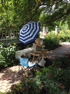
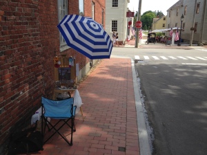
The day before the start of the competition I had purchased a $5 umbrella from Five Below to keep the sun off my canvas. Though my setup was by far the least expensive and the most jerry-rigged of all the contestants’, it worked and that is all I needed.

IMG_3165

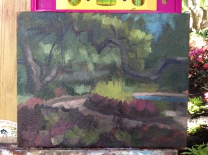
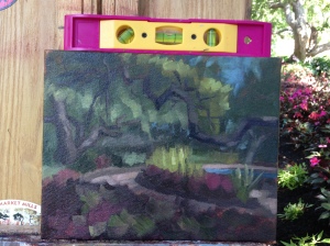
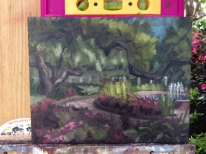
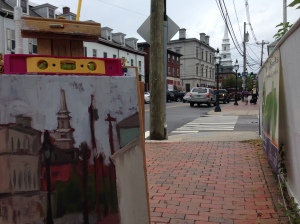
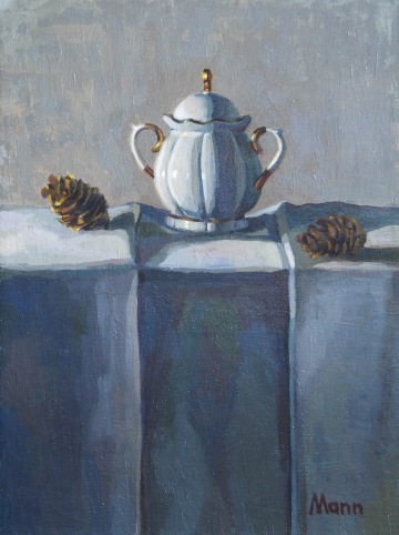
For my last few paintings I have used burnt umber or burnt sienna toned canvases. There’s something intimidating about a completely white canvas and the tone diminishes that aspect while also contributing a base dark to work from. Additionally, with plein air painting the reds of the tone provide a nice complement to the greens of nature. Here you can see I also brought a level to avoid accidental tilts or skewed perspective.

IMG_3166

A couple hours into the painting my parents showed up with some surprise drinks and snacks. They were on their way to Nova Scotia and wanted to say hello. For the next three days I chomped on the pretzel thins they brought.

IMG_3167

While I worked on my painting the gardeners worked around me, pulling weeds and laying down loam. They’d told me early on that I may get wet when they turn the sprinklers on, but thankfully I was done before that happened. I may have been motivated to work fast because of that potential threat.

Prescott Park

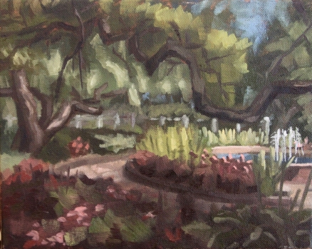
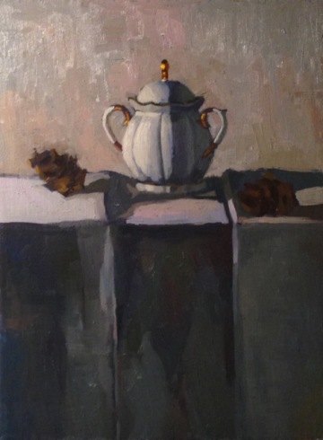
Gardens at Prescott Park   8″x10″

Towards the end of the painting other artists began showing up and I directed a few towards the gallery. I had an older couple walk by and tell me that they’d seen quite a few of the other artists and that I was the youngest one, and the only male so far. Which wasn’t surprising. That’s been the reality of all of the classes and programs I’ve participated in. Only one other male student went on the Italy trip and in most of my undergrad classes I was one of three guys. Even in my English classes the proportions were female heavy. It’s great that love for the humanities and the arts is still very much alive, but it is kind of sad that I don’t have many same-age male artist friends to share experiences with.

I was satisfied with my first painting and ready to move on to the next one. I packed up and hiked out of the shade and into the heat. A couple blocks away I found another spot and plopped on down.

IMG_3172

It was around noon at that point, with the sun directly overhead. It’s hard to paint at that time due to the lack of long, deep shadows. But I knew which way the sun was setting and figured I could get the painting started and wait for the shadows to come to me. So I sat in the sun and was shortly back in the shade as the sun creeped down to the west.IMG_3170

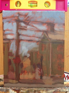
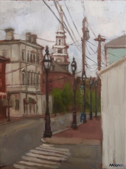
Telephone poles have a paradoxical beauty that fluctuates between the complex and the simple. There’s not much to them besides a pole, a transformer box or two, and wires, but the sheer number of wires can make them appear complicated. It’s this beauty that has me mesmerized. In the fall I did a two day paint of a cluster of telephone poles that really got me hooked. Since then I’ve found myself staring up and thinking of how to include them in more paintings. The competition was a perfect opportunity to see what I could do.

IMG_3171

The view I chose for my second painting looked down into the heart of Strawberry Banke. The buildings I painted were hundreds of years old. Did the people who originally built them ever think that someone else would find their homes picturesque? I certainly love old colonials and I wonder if our current homes will ever be seen with as much interest and nostalgia.

IMG_3173

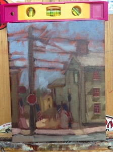
By the time I’d blocked in the painting the sun had lowered enough that some interesting shadows were appearing. I quickly threw them in, knowing that they’d soon change.
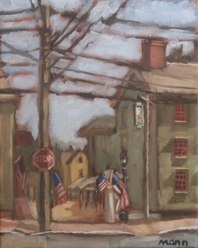
Nest

Nest 8″x10″

Four hours in I was ready to call it done. My eyes had spent enough time on one subject and the light was changing to a point that I couldn’t continue. I later decided to call this painting Nest due to the tangle of wires that dominate the upper third. It was a fun view to paint and the American flags brought me back to my days working on my Bennington Flag painting Hammer to Fall.

All wrapped up I headed into the center of town to meet up with my girlfriend and paint her portrait at Market Square. Since the sun was disappearing and I only had her as a model for two hours, I hurriedly painted her in and saved the background for the next day.

11694752_10204587071461506_6132293488552859729_n

Day two began with me waking up to torrential rain at 5:30 and deciding to hold off on painting for a bit. It lessened up in a couple hours and I drove through the showers into Portsmouth around 8:30. Amazingly it cleared up and the weather held off for the rest of the day. I can deal with overcast. I don’t exactly have an umbrella large enough to protect all my stuff from hard rain.

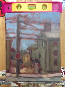
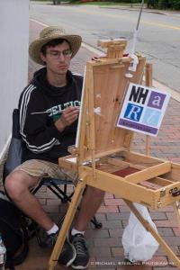
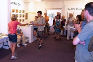
A short distance from my car I looked up at the telephone poles, saw the church steeple in the background, and found my spot. I’d told myself I wouldn’t paint the steeple because it was too generic. Everyone has photographed or painted it. But I felt the lines and poles added something new to it. Partway through the morning I met New Hampshire Art Association photographer Michael Sterling, who took the above photograph of me for the association’s Facebook page.

IMG_3174

As the days and hours went by I took fewer progress pictures. I’d always remember to do it, then see something that needs to be fixed in my painting, postpone taking a photo, paint away, and then forget to take the photo. It was an endless cycle.

Overcast

Overcast  12″x16″

This piece was my largest of the weekend by far at 12″x16″. It took me until four in the afternoon. I spent a solid chunk of time working out the composition, eventually going with a triangular approach with the tip of the steeple being the top of the triangle. There was a lot more I could have done, but like I mentioned earlier, I tend to tire of a subject if I spend too long on it. If the contest was a week long I would have let it sit for a day or two and then returned to it.

Portrait of Sarah at Market Square

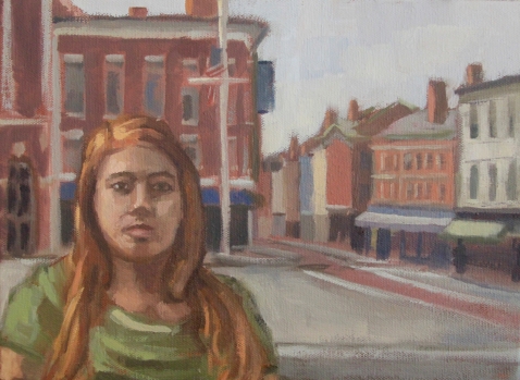
Portrait of Sarah at Market Square 9″x12″

With a few hours left of daylight I returned to Market Square and worked on the portrait of my girlfriend. It was a bit frustrating because I could not place myself in the original spot. Other people were sitting there. I was also battling a sore shoulder from holding a palette all day. I painted quickly and went home to a hot shower and some quesadillas.

IMG_3194
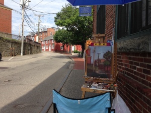
Day three was crunch time. I only had until noon to work. Three pieces needed to be submitted at that time for jurying. I got into the city at seven, hiked a short ways, and found a spot without fuss. Despite all the preplanning and city exploration I did before the contest, I never used any of my pre-picked spots besides the first one in Prescott Park. I just walked and was fortunate to find subject matter quickly. It helps that the city is gorgeous.

11705612_1465958913704497_7893740499672882910_o
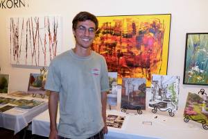
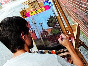
Two-thirds of the way through the morning I met another New Hampshire Art Association photographer: Bill Moore. We talked for a little while, he snapped the above picture, and him and his mustaches and smile went on their way.
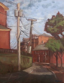
To the Side

To the Side  11″x14″

With excitement and satisfaction I finished my final painting of the competition at eleven. I met my girlfriend at my car and she helped me carry my paintings to the gallery. I selected the three pieces with telephone poles: Nest, Overcast, and To the Side. I felt as though they would exhibit well together.

1556217_10153447837645903_9152143873841487315_o

The competition was juried by Carol Aronson-Shore, a local artist who has done a lot of paintings of Portsmouth and Strawberry Banke. I did not get to meet her as it seemed she was not at the awards ceremony afterwards. Which I understand. No one wants to be confronted and questioned about their decisions and berated for making the wrong ones.

The final showing of all the pieces took place at three and I was happy to find that I had received an Honorable Mention for To the Side. There was certainly a part of me that was disappointed though. I had almost been expecting to place in the top three. I’ve always had a lot of self-confidence in my work. In undergrad classes I’d go around the room and look at everyone’s work and mentally try to calculate if I was one of the best students. I usually thought I was. That’s not to say I was cocky though. Simply, I am always proud of my work. This outlook has been beneficial and encouraged me to continue on with my art. I look back at my old paintings and drawings now and I question what I was thinking. Did I really think that was good art? But the self-confidence in the moment kept me going and so I continued to improve.
11728846_10153447834790903_7496215124281956325_oAfter the show was over I took a hard look at my paintings. I can see where I need to improve compositionally and more than that, I can see where I need to improve with color. When I first started painting I put varying color in every part of my paintings. It was very Impressionistic. Since then I have gravitated to a blockier, single color style. However, I need to find the happy median. There needs to be more color and variety in my work. Part of the problem is my earth tones palette and the fact that those pigments dry dark. I will have to take more time with my paintings and realize that the moment I feel done is the moment that real painting begins.

As a final note, all the paintings here are up for sale. I will eventually have a shop set up for prints and originals, but for now here are the prices:

Gardens at Prescott Park – $150

Nest – $250

Overcast – $400

Portrait of Sarah at Market Square – $200

To the Side – $300

If you would like to purchase one of the pieces, please email me at thewritingmann@gmail.com.

0

Parsons Beach and Ducks

On the 26th I finished my last summer class and now I’m able to fully enjoy the weather. The next day we headed up north to visit my girlfriend’s sister in Kennebunk, Maine. She lives a few minutes from Parsons Beach, so we hopped on over there and spent the early afternoon soaking up the sun. I actually soaked up too much sun. The sunburns have been annoying. Time to get the season really started and buy some sunscreen.
Sarah and Allison

We were there for about three hours and I probably got two hours of quality painting in. Spent a good thirty minutes at the start figuring out what to paint. Eventually I settled in and painted my girlfriend and her sister. It came out pretty decent for a sketch. Used a 5″ x 7″ panel.

On Sunday I squeezed in a couple sketches of mallard ducks for Sketch Daily’s summer prompt.
Mallard Male

Mallard Female and Babies

Down behind my apartment in Newmarket, New Hampshire is a boat launch that slides out into the Lamprey River. Any time of the year a flock of ducks can be seen waddling around the area. During the winter they lay across the pavement for warmth. During the summer they hangout in the adjacent park and beg for breadcrumbs. I park my car down there some days and they always shuffle on over to say hello and see if I have anything to share.

Guess they were my inspiration. Though I didn’t have any pictures of them, so I had to make do with what I found through a Google search.

0

Roadtrip to New Orleans

Thirty something hours later and I’m back in New Hampshire. My butt is flat and I have a persistent crick in the left side of my neck. This past week some friends and I ventured down to New Orleans and we drove both ways. It’s a long ride. Two long rides really. Next time I’ll bring a super comfy cushion and a neck pillow.

Before I left though, I managed to get a few more paintings done in College Woods. If you remember in my last post I said I’d finished a painting, but was waiting to post it.

Woods 5:17:15

There are many bridges that arch over the wetlands of College Woods and this particular one crosses over Oyster River. I think the painting came out decent, though it was hard to paint the path receding into the woods and climbing up around a bend. I’ve found that I’m not very adept at constructing convincingly deep backgrounds. You’ll also notice that the camera picked up the lines of the rough, underneath gesso layer. I wanted the gesso to give me a nice texture, which would have been fine if I was painting with thick strokes. Those days are behind me though and I tend to thin out my paints more now. I didn’t realize how noticeable the gesso was going to be underneath.

This painting was done on another one of my 5″ x 7″ canvas panels. They’re okay, though not exactly uniform in shape and they tend to warp when drying. The warp can be fixed however, and since I’m still basically practicing, the non-straight edges are not that much of a problem.

A few days later I got back out into the woods, exploring an unfamiliar entrance. It didn’t take me long to find my subject matter. 

Woods 5:20:15

This old tree was the perfect variety of color. The bleached-white, exposed wood was a great contrast to the grays in the branches and trunk. I had a lot of fun mixing colors and figuring out if they should be warm or cool. I got lost in the painting and I think that’s what makes it my best piece in a while.

The next day I went out looking for a similar subject.

5:21:15InProgressI remembered to take an on-site picture this time. You can see how I was once again attracted to the variety in color.

Woods 5:21:15I’m afraid that I once again floundered with the background. But I’m not sure. Sometimes I look at it and it works. Sometimes it doesn’t. A couple days later we were off to New Orleans.

The ride down took us 34 hours, while the estimated time was 24. We didn’t take extra long bathroom breaks. We didn’t stuff ourselves constantly at the roadside Waffle Houses and Popeye’s. We didn’t purposefully waste time. We broke down and spent an afternoon being towed and waiting for a new radiator to be located and installed. Everyone we met was so incredibly nice and hospitable. All the customers who came into the shop asked us where we were going and then gave us suggestions on what to do. The main clerk let us spread out in the waiting room and eat a lunch bought at the Winn Dixie next door. It was an experience. Eventually we got fixed up and drove the last two hours into New Orleans.

The next morning I woke up early and wandered around looking for a place to paint. It started to rain, so I wound up back on our apartment’s porch.

GnomeOnSite1The little house we stayed in had a wonderful amount of quirks. The kitchen wall was an underwater mural decorated with iron and wood painted silhouettes of fish and nailed-on fishing lures. The living room had a wooden throne and an antique artillery round. And all over were gnomes. I found one on the porch and moved him to a more agreeable area for painting.

GnomeAll my paintings have been drying dark. I think it’s because my palette has consisted of mostly earth tones. I also think that since I’ve been working alla prima I haven’t had a chance to really punch out the lights and darks in multiple paint-throughs.

Later in the week we drove out of the city to see a plantation and take a swamp tour. On our way out we passed by all the city’s beautiful cemeteries. I returned to one  the next day.

CemeteryOnSite2Since most of New Orleans sits at or below sea level the residents have many issues with the water table. One issue is that they can’t bury their dead in the ground. Either plots of land are raised up and walled in, mausoleums are used, or the dead are given small stone houses to rest in.

CemeteryOnSite1We had lunch reservations for 1 and I didn’t pick out a spot in Greenwood Cemetery until 9. I hurried along as fast as I could, keeping my shapes large and only working in finer details in the last 30 mins before noon.

CemeteryThough the painting is unrefined, my mind seems to combine the masses and make the gravestones clear. I was really going for the repetition of shapes and chose the spot because of the abundance of tall crosses.

On our final day I went with my girlfriend Sarah to the New Orleans Museum of Art in City Park. I saw a lot of art I liked, but there was one painting I spent a good amount of time studying.

TheToiletOfPsycheThe Toilet of Psyche by Charles Joseph Natoire is a rather large painting full of life-size figures. But what caught my attention was the drapery at the bottom.

TheToiletOfPsycheThe piece of cloth is a strong example of how using complementary colors can make something pop. The red shadows work well with the yellow and blue greens in the rest of the cloth. The whole painting is extraordinary to see in person, but I spent most of my time staring at the cloth. I need to give the effect a try.

I like going to a museum every week. I might pop down to the Currier Museum in Manchester, NH next. Saturday mornings are free for NH residents!

2

Painting in College Woods

At last I am done with the semester. First year of grad school out of the way! To celebrate I headed out into UNH’s College Woods to do some plein air painting. Well, first I bought some 5″x7″ canvas boards, gessoed, and toned them and then I went out.

Woods 5:14:15

Last Thursday was my first real free day and so I got up at six and headed to the woods. Campus was dead, even though graduation was just two days away. It was cold, the sun was barely up, and I bundled up in two layers of sweatshirts. After walking around a bit I finally picked a spot. The lighting was nice and creating a network of interlocking shadows on the tree trunks and ground. I spent about three hours working before the mosquitos drove me away. I met quite a few runners and dogs that morning.

Woods 5:15:15The next day I got up again, though a little later. I made it into the forest by 7:30 and found my spot by 8:00. I parked at a different entrance than last time and found myself on the far side of a pond. I picked a shady spot next to the water and painted the rising trail path. It was a bit more difficult of a painting than the first one. And once again I got driven away by mosquitos. They were horrible. Of course, I’d picked a bad spot as well. But I went out and bought bug spray on Sunday and it was a different story when I went out to paint that afternoon. (I’ll have Sunday’s painting up in the next blog post.)

On Monday the girlfriend and I traveled down to Boston to check out the Leonardo da Vinci drawing exhibit. The da Vinci drawings were mesmerizing and they were juxtaposed with drawings from his contemporaries, like Michelangelo. It was fun to try to compare the artists and see what their differences were. Unfortunately it was a short exhibit. But fortunately there was another major exhibit in the museum, a Hokusai show, so we headed right over to that.

Hokusai was a Japanese artist now known primarily for his print of The Great Wave off Kanagawa. The exhibit was an exhaustive collection of his works, and though it was interesting to see The Great Wave and the other views of Mt. Fuji, my favorite prints were the ones he did of waterfalls and bridges. Here are my three favorite:

OneHundredBridgesinaSingleView

One Hundred Bridges in a Single View

TheHangingCloudBridgeatMountGyodonearAshikaga

The Hanging Cloud Bridge at Mount Gyodo near Ashikaga

TheFallingMistWaterfallatMountKurokamiinShimotsukeProvince

The Falling Mist Waterfall at Mount Kurokami in Shimotsuke Province

There’s a mystical quality about the prints that I absolutely love. While the latter two are from real locations, the first print was concocted after Hokusai had a dream of the place. I’ve been into comics a lot lately and it was interesting to see how graphic and similar Japanese prints are to traditional comics.

After the Hokusai show we wandered around the museum and I decided to do a sketch of Max Klinger’s marble bust of Beethoven.

Beethoven

I tend to gravitate towards sculptures when I’m looking to draw in a museum. It’s hard to replicate a painting through pencil, pen, and white pastel.

BookScanCenter_2 (1)

And when I’ve been given the chance, I’ve turned to doing some imaginary sketching. Here’s a recent doodle that started when I accidentally sketched out the outline of the bunny’s head. I was going for a sea lion, but my pencil had other ideas.

I’m gonna try to squeeze in another blog post before the end of the week. We’ll see what happens. I’m headed off on a road trip to New Orleans on Saturday. I’ll be bringing my easel along!

7

From the Bathroom to the Canvas

I was in the bathroom last weekend watering the lettuce I’m growing in the window when I got to looking at the way the light fell on the wall sconce. The glass body diffused the light while the golden base reflected it sharply. It was a nice contrast. And since I haven’t done an oil painting in a while I thought the lamp would make a good subject for a new painting. Plus I have a lot of 16″x 20″ canvases that need to be used up. I grabbed one and got to work immediately.

Lamp 1 Final

Last time I tried drawing in the bathroom I ran into a space issue with my easel. There was no reason to deal with that again so I just took a picture and worked from that. I kept the painting simple at the start to prevent it from becoming a replica of the photograph. After that I started every session by reminding myself not to get too focused about details. Keep the painting painterly. That was my motto.

Lamp 2 Final

Recently I have been watching videos of how other artists paint and I’ve also spent a good amount of time looking over paintings at museums and galleries. Analyzing the work of other artists has helped me pick up a few tricks. One revelation came while I was visiting the Museum of Art at UNH. It was the end of the semester show where the professors present their recent works. I stopped in front of a landscape painting by Brian Chu and checked out how he dealt with the background. The majority of the painting was clouds and sky and though the clouds were the focus, Brian Chu put an immense amount of effort into the empty sky. It really made me realize the importance of backgrounds. Keeping that in mind, I worked heavily into my background, making sure it helped my lamp pop forward.

Lamp 3 Final

Like usual, I began the painting with large shapes of color and then broke them down. You can see how I distinctly divided the reflections in the gold base.

Lamp 4 Final

Once I got the lamp base to a point I liked, I scraped it down. This prevented me from overworking it. I then left the painting to dry.

Lamp 5 Final

Here you can see I focused on the background, smoothing out the large shadow shape and working in some overall darker tones. I realized I was painting the wall too light and it needed to be darker in order for the lamp to appear as though it was jutting from the wall.

Lamp 6 Final

The body of the lamp was difficult to paint. I struggled to make it “turn” in space and appear rounded. The most difficult part was painting the crenelated top. The edges were a balance between darks and highlights and I fought to keep the shadows from getting too dark. I used my palette knife to scrape it down a lot.

Lamp 7 Final

Throughout the painting I went back and forth between slapping on decisive strokes of paint and smoothing out the transitions between tones. If you compare the above picture with the previous one you can see this seesawing battle take place on the lamp body.

Lamp 8 Final

By now you’ve probably notice the little winged dot below the lamp. That’s a hole in the wall with flaps of sheetrock. It wasn’t the easiest thing to paint, but I think I got it down okay. It pulls together towards the end. But I included the hole because it gives the painting an extra bit of character. It helps prevent the lamp from just being a lamp. The hole gives the viewer a little more information about where the lamp could possibly be and the physical state of that location.

Lamp 9 Final

To give the painting more depth I darkened the lamp shadow considerably.

Lamp 10 Final

While the lamp base gives off the overall appearance of being gold, I used mostly green and brown to paint it. I would mix the green with a decent amount of white until it was quite light and then I would mix in some brown to give it the yellow color it needed. Of course, I used cadmium yellow when this combination could not get me the proper color.

Lamp 11 Final

Painting the base demanded that I measure and remeasure. The slightest inconsistency or straight edge ruined its roundness and threw the painting askew. I stepped back often to see where I was going wrong and where I needed to make adjustments.

Lamp 12 Final

Here you can see I added white to the right side of the hole and that helped sell the idea that the sheetrock was being pulled off and away. Also, I’d like to mention here how much I like the reflected yellow light right above the hole. For some reason I got so happy when my eye caught that detail and I joyfully included it in the painting. It does a good job of demonstrating the reflectivity of the lamp base.

Lamp 13 Final

And done! I think. While writing this post I noticed a few things I’d like to fix, but I probably won’t go back and adjust them. I’m ready to move on. And now as I stare at it, it’s starting to look wobbly and funny. Oh dear.

I don’t often name my paintings, but I thought of one for this painting while I was working on it. I think I’ll call it View from the Toilet. Cause after all, that’s what it really is.

Below you can see an animated GIF of the progress photos:
output_L1C45X